
Customer Journey
The process started with her personal experience of making a reservation during work hours. She noticed that she wasn't able to book a table easily from her Android phone. She had to call the restaurant, and she realized that she only could make a phone call during restaurant hours. From her personal experience, I wanted to explore more and see if other dinners might feel the same.
User Interviews
I interviewed some of Fishworks' regular customers and some dinners around the Downtown Vancouver and North Vancouver areas. The purpose was to understand the customer's challenges when they use the website and to analyze different points of view. By extracting different insights and common behavioral patterns from the customers, I created two personas. Understanding the dinner's needs is a great way to challenge our preconceptions and assumptions of what would be the ideal design solutions.

Key Challenges
The stakeholder interviews, customer journey and user interviews revealed a few major pain points:
Some of the customers have vision issues, which makes it hard to view the menu from the mobile device.
The reservation button on the mobile device is hard to find.
Customers with health issues or diet restrictions find it hard when the menu items are not well marked.
Problem Statements
How might we improve the restaurant’s mobile user experience?
How might we make the reservation experience more efficient and effortless for Fishworks dinners?
Visual Design Process
Visually bold images on the homepage introduce the freshness of the food, cozy yet sophisticated ambiance of the restaurant and a conversation of the restaurant's history.
Typography
I used Adobe Garamond Pro for the main header and paired with Proxima Nova to complement the visual design of the website. I decided to combine these two fonts because they’re the perfect blend of classic and modern fonts, clean, elegant, and they have high readability and flexibility.

Colour Palette
We wanted to maintain and bring the brand's consistency from the website to the dining experience. Fishworks aims to embrace the feeling of comfortable, reliable, affordable and sophistication. We decided with black, brown, grey, and white as the primary colour palette of the website.
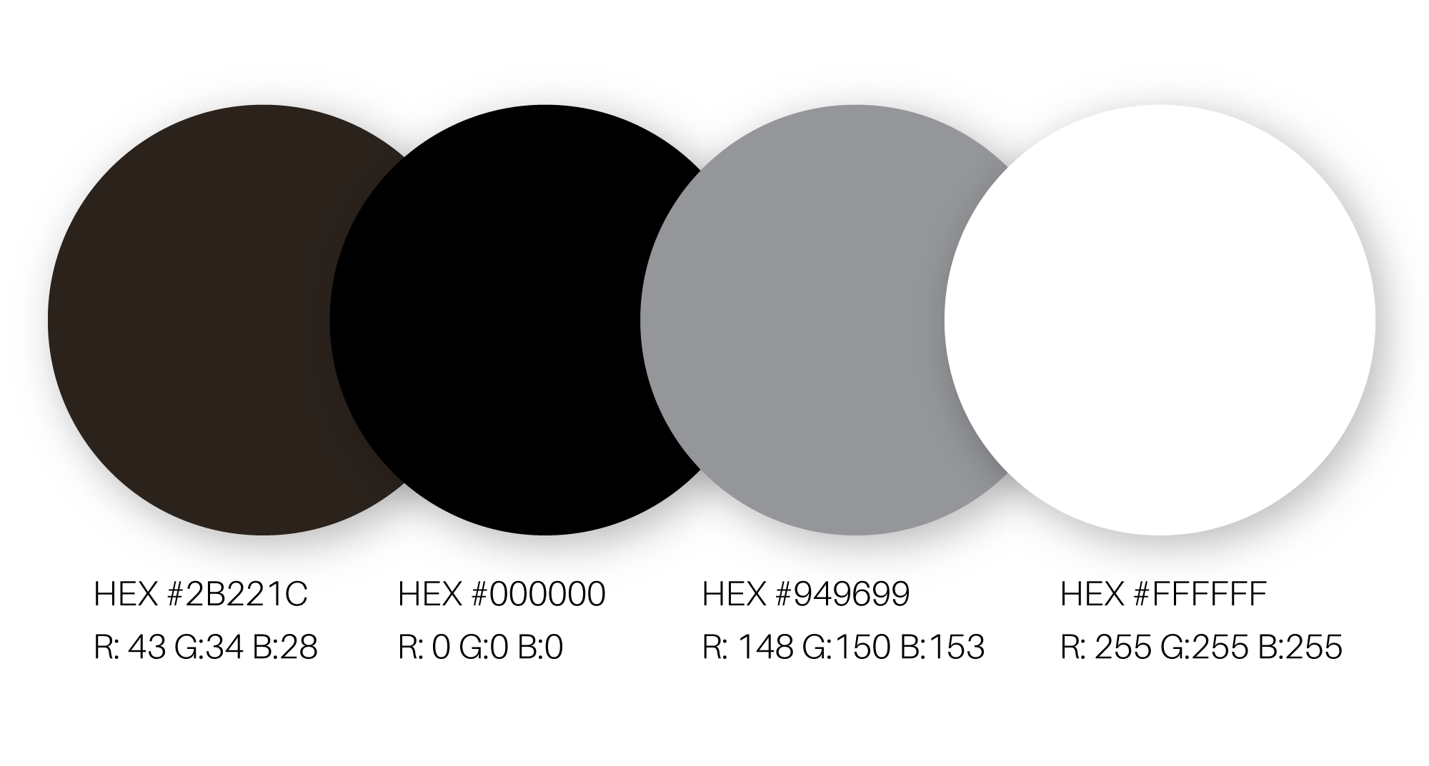
To ensure we use the accessible colour combination, I calculated the contrast ratio of the foreground and background colours would pass the minimum requirement of Web Content Accessibility Guidelines (WCAG 2.0).
Photography
One of the primary purposes of the Fishworks website redesign project was to update the overall look and feel while maintaining the brand style. Each page uses eye-catching and droll worthy images from the most popular menus. While Chef Shallaw prepared and styled the new dishes, I've created a custom photo backdrop for the food photography that represents the chosen colour palette. Finally, we produced some hero images by mixing flat lay to 45-degrees angles.

Final thoughts
Some features that we would like to add in the future are live updates of the available tables, calorie information on the menu, and e-gift card integration. Integrating an interactive live map from mobile devices will allow dinners to book the tables and reduce the wait times at the restaurant. Also, adding calorie information will enable customers with dietary restrictions to look at the menus before making reservations. Fishworks always promotes environmental sustainability. The e-gift card integration would be ideal for non-local customers.

Conclusion
The newly updated Fishworks website is responsive and intuitive. Customers can view the menu from their mobile devices. The placement of the OpenTable widget and a button with the phone number on the landing page makes it easier for customers to book the reservation. To gain a better evaluation of the new web design, I also relied on usability testings. After discussions and testing with some users, I found that some were comfortable making the bookings through the landing page while some users prefer to visit the contact page and make a phone call. Customers also mentioned that it feels more personal to call the restaurant directly. I created a simple button below the reservation page to allow customers to make a call. Now the landing page has two options: First, for customers who prefer to book a reservation through mobile and second, for customers who prefer to call. This website project is an ongoing task with continuous iteration processes. New features and designs will be added based on customer feedback.